Valerie Romano grew up on Long Island, New York, and spent over three decades in Santa Fe, New Mexico, where she learned to paint and began selling her work at the Santa Fe Artists Market. Trained in illustration and design, she worked in textbook illustration in New York City before becoming a commercial illustrator at Boeing, creating technical aircraft drawings and training materials for U.S. Air Force pilots—an experience that sharpened the precision and discipline evident in her work today. She later taught drawing at Eastern New Mexico University, mentoring emerging artists.
Her nonprofit work with Save the Chimps, where she created a portrait series under the guidance of Dr. Jane Goodall, deepened her belief in art as a vehicle for healing and advocacy.
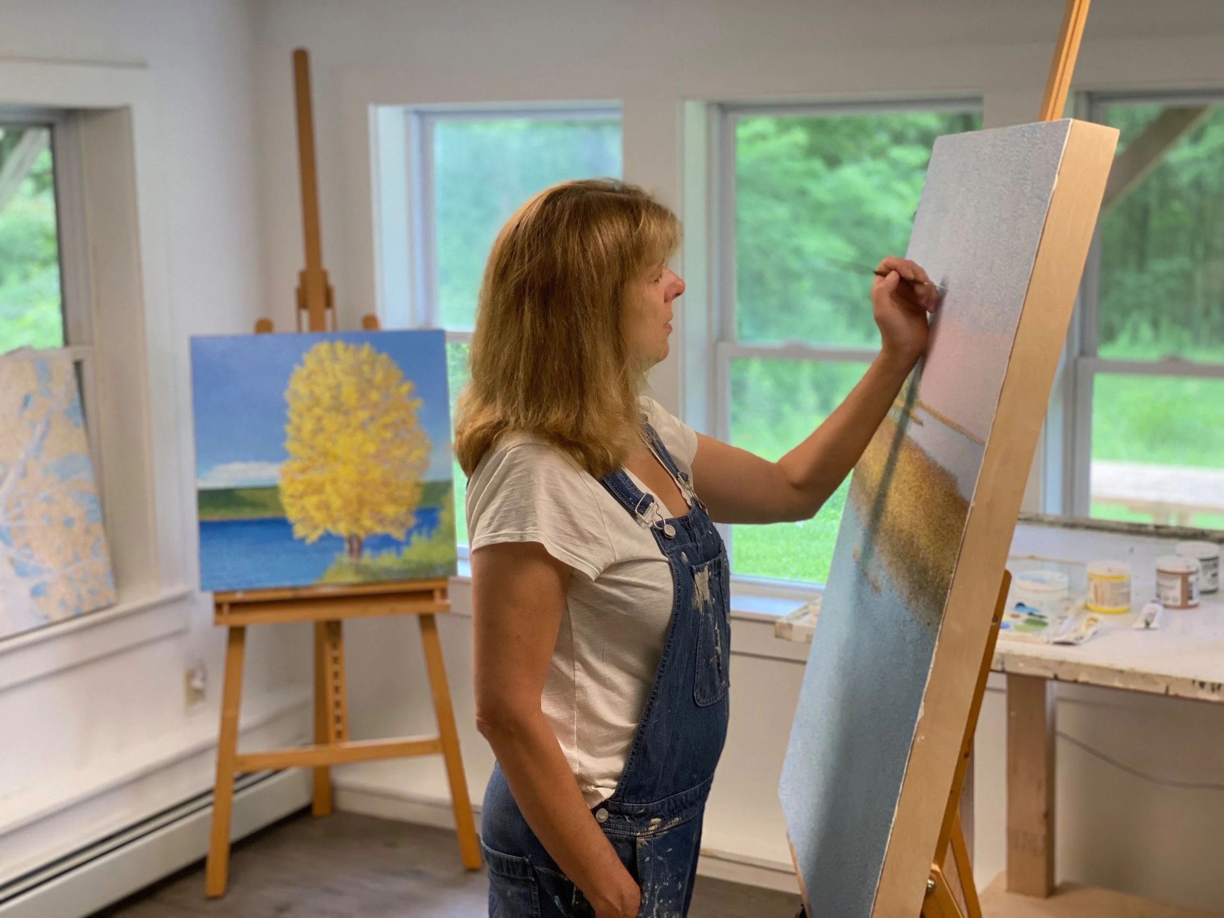
Now based in New England, Valerie is recognized for her distinctive pointillist landscapes that capture light, atmosphere, and the quiet complexity of forests, coastlines, and reflective waters. Birch trees and shifting seasonal color have become recurring motifs, rendered through meticulous dot placement that transforms observation into luminous surface and depth.
Since 2010, her paintings have been exhibited nationally in galleries and top-tier fine art festivals, earning numerous awards and a broad collector base. She serves on the Board of the Rittenhouse Square Fine Art Show and is deeply committed to accessible art education, volunteering her time to teach painting to blind and visually impaired students. Valerie divides her time between studio practice, exhibitions, and teaching—capturing the feeling of the place she now calls home, one dot at a time.